Case Study: A Way to Work Out with Friends and Other Fitness Enthusiast in the Community
Suza Fitness is a platform for millennials who are exploring new ways to stay happy, healthy and fit to connect with the community and find group fitness classes.

Project
While our tasks was to design a digital experience for fitness, we had a broad range to design for any technology as long as our research shows it to be the best choice.
Our team focused on defining the UX strategy of the fitness platform, starting from initial research to delivering final MVP specifications
Problem Statement
Millennial exercise enthusiasts need a way to connect with like-minded fitness enthusiasts because having a strong fitness community helps them be more motivated to remain consistent with their fitness routine.
Role and Time Duration
UX Designer and Researcher, Team Project
6 weeks
Tools used: Sketch, Invision, and Photoshop
Research on the Fitness Industry
An average American
%60 of individuals have little to no physical activity
%25 have no physical activity
Group Exercise
98.8% adhere to group fitness classes
Why did I chose these 6 as my competitors?
Direct Competitors: Trip Advisor, Lonely Plant, With Locals, and Airbnb.
I chose these as my direct competitors because they exhibit quality local and international experiences. It cost to book and make reservations through the website.
Indirect Competitors: Couchsurfing and Yelp.
I considered indirect since it was free to use the service. Couchsurfing allows travelers accommodation through acts of hospitality and connection, while Yelp is limited in only showing reviews.
Lead competitors in the travel industry market
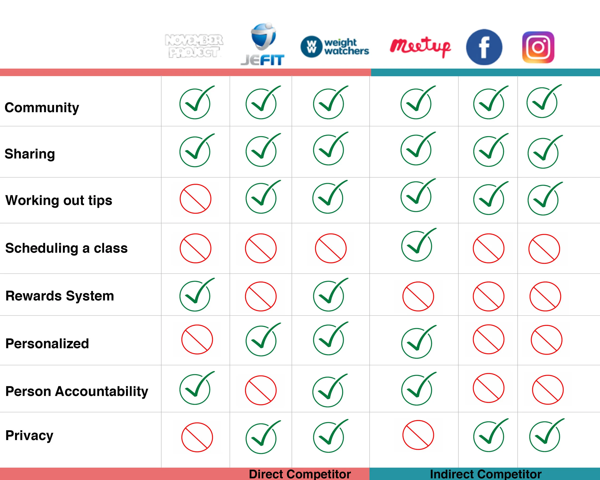
Why did my team chose these 6 companies as my competitors?
Direct Competitors: The November Project, Jefit, WW (Weight Watchers)
For direct competitors, we chose platforms that specifically focused on bringing individuals together to achieve shared fitness goals.
Indirect Competitors: Meetup, Facebook, Instagram
For indirect competitors, we chose social networking and community platforms that may tangentially host fitness groups but that do not solely focus on health and wellness.
Understanding the Users

Interview 1
Christina is a 30 years old copywriter for an ad agency downtown of Chicago. She lives with her significant other and her dog Parker.
“I usually travel with family but the lack of collaboration in choosing places to see is frustrating. We don’t always agree so sometimes we split up".

Interview 2
Oliver is a 34 years old Motion Graphic Designer living in East Village New York. He lives with his wife, 3 year old and 6 month old baby.
“With a growing family and high expenses living in New York. I would need to be able to budget for future trips. The thought of it stressful.”

Interview 3
Michael is a 33 years old Photographer living in St. Louis with his significant other.
“I want to travel more and see new places. This is a goal of mine before having a family of my own. I find traveling both exciting and stressful.”
Key takeaway and insights from our 3 interviewees
All interviewee’s travel with their significant other or spouse.
All travelers rely on reviews when it comes to choosing a location to visit.
As Creative Professionals, quality of time is important to them.
Budget-friendly travel is a must.
Narrowing down the Persona

Lisa is a 32 year old Art Assistant living in New York. She lives with her husband and two dogs. Lisa is also expecting.
“I still want to travel in the near future but as a new mother, I want to stay organized and budget my trips. I also want an easy way to view quality experiences.”
Identifying the Problem Statement
As a budget-conscious millennial with a growing family, I need a simple way to organize my quality trips while staying on budget.
Creating User Stories to describe user wants to achieve
As a user I need a simple way to simply add how much I am spending.
As a budget-conscious Millennial I want to be able to view my budget. I want a simple way too see how much I am spending for each category, such as: food, shopping, entertainment, etc.
As a busy professional and future mother I need a simple way to be able to find read reviews to find quality places to visit.
As a busy professional, organization is very important. I want a way to organize my trips through the app.
Ideation Sketches and Wireframes

My main goal through the sketches was to tackle the problem statement. I sketched out screens focusing on two main concepts; the budget and itinerary.

Moving on from paper sketches to mid-fidelity.
Not so perfect.
Building the Application Map
My process for this application was not so perfect. Near the beginning of the project, I started broad by considering that I should build an Uber of the Travel Industry. I did not understand who my persona was and did not fully grasp who my competitors were. Going back to the drawing board, I could revamp and solidify who my persona was to build a more strong archetype to build on one or two vital concepts. I needed to identify the user’s pain points and motivations. By doing this, I was able to identify who my persona was. Below, you’ll find the app map reiterated three times. From then on, I built on two main concepts.

Testing Bon Voyage Mid-fidelity Screens through Usability Testing
Methodology
Three users were testing the Bon Voyage mid-fidelity prototype. Each user was sent an Invision link where they were able to access the mid-fidelity prototype. The users used their apple phones and shared their screen through a recorded zoom session. From there, I was able to observe the three user behaviors.
Analysis
General requests such as changing the Inbox section, budget tracker functions and homepage location. Overall, the results of the testing were very helpful due to both positive response and receiving critical feedback.
Iterations based on feedback
According to user insights and key takeaways I reiterated on the screens mentioned.

Inbox
Reiterations 1 and 2: 2 out of 3 users mentioned that they were confused about the inbox. They asked how the inbox would be used to contact locals. They asked if notifications would alert them if there are any changes and suggested to see that instead. I removed the Inbox Screen and inbox navigation. I plan on creating another alternative way for users to connect.
Budget Tracker
Reiterations 3 and 4: All 3 users liked the Budget Tracker but due to the poor design, 2 users mentioned that they would like to see how much was spent at a restaurant. One user mentioned that Plane ticket would be unnecessary for the budget tracker because it’s money already spent. A new tracker screen with individual changes were created. The Plane Ticket and accommodations were removed. A new scanner tool was also added.
On-boarding Tracker
Reiterations 5: Two user didn’t care for the scrolling tool at the beginning of the on-boarding. They would prefer a drop down.
Homepage/Home Navigation
Addition Reiterations: I made a poor design choice by not creating a home button. I had prototyped the logo to return to the screen but 2 out of 3 user’s were confused. After: By removing the Inbox icon on reiterations 2 I had room to add the home button.
Changes according to user feedback

Instead of an Inbox, I decided that through the Itinerary that any detailed updates could be found on here.
A new and improved Budget Tracker that is easy to track overall spending including the different variety of categories.
A new On-boarding Budget screen was created allowing users to choose a suggested budget from a drop down menu or for user to input their desired budget.
Exploring the Visuals
Approach 1
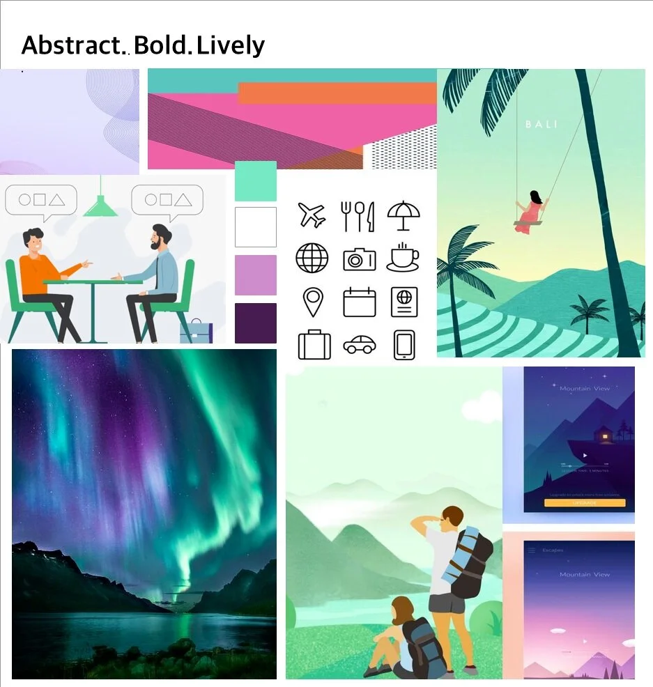
Approach 2Style Tile I explored different typography, color pallets, illustrations of iconography, and photography to set my moodboards.
I envisioned two types of styles shown which an outline of the details. After evaluating the two moodboards, I decided that approach 2 would best fit the overall feel and style of my idea. Below, you’ll see what those visuals are:
• Approach 1 - A design that was abstract, bold, lively. Responsive and interactive. On the go.
• Approach 2- An airy feel of going somewhere. Simple, earth, and organic.
Solution
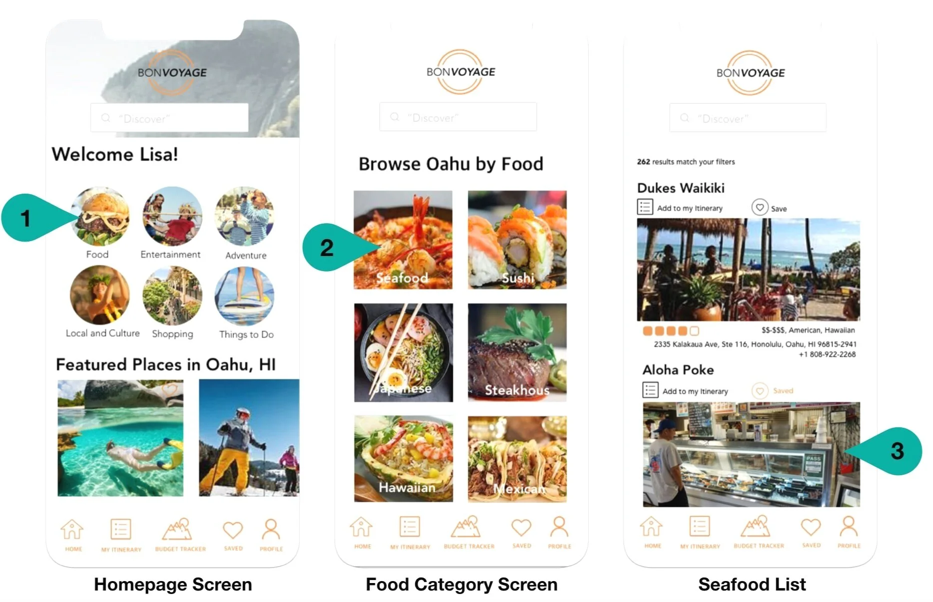
Searching for quality experiences with good reviews and then adding it to the itinerary. In this example, Lisa is searching for a restaurant with good reviews to add to her itinerary list.
Teardrop represents the steps the user takes to achieve completing the tasks

Keeping track of budget. Lisa has a receipt she wants to scan in to add to the food category budget.


High-Fidelity Prototype
Next Steps
For the future, I would like to explore AI as a concept to manage the user's itinerary and budget.
Also, users being able to listen to their itinerary for that day through voice-over.