U-Snap
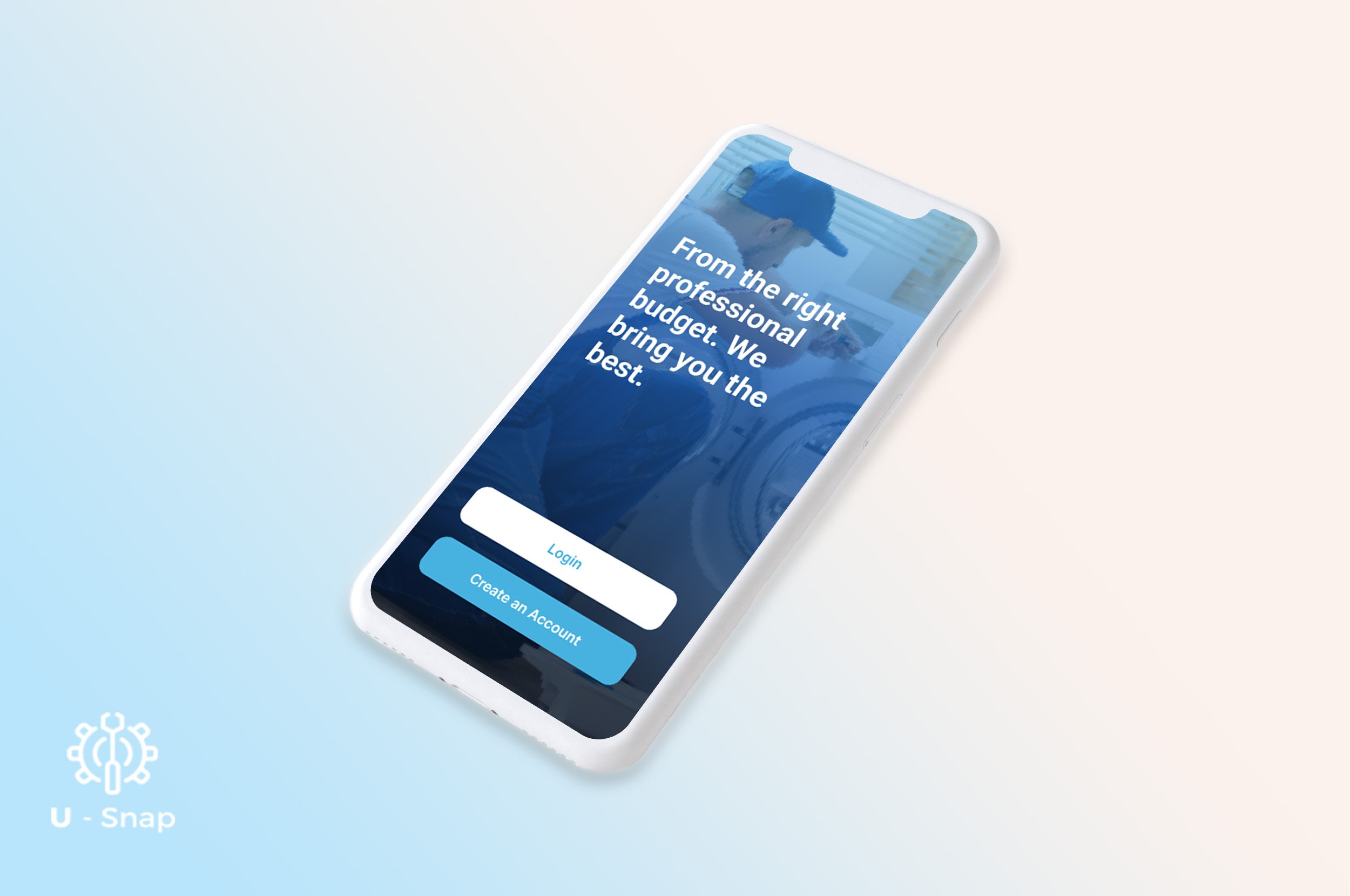
The U-Snap Application is a home service professional marketplace that allows Homeowners and Renters to seek qualified Professionals to complete tasks and repairs. U-Snap also gives Home Service professionals a place to list, share and find jobs under their speciality and license.
The U-Snap Case study only shows the Research Portion of the project.
The Project
U-Snap is a Home Service Application available on both iOs and mobile devices in the App Store. The application was previously developed but not fully advertised for consumer use. The Product Owner was not satisfied with the initial design and felt that the app needed a redesign. Mid way through the project, we added two UX Writers and another UX Designer. This project is a current and ongoing. I worked alongside another UX Designer to improve the current state of the application. In this case study, you will see the process in how we conducted UX Research strategies and methods to recognize, understand, and validate areas of improvement.
The Approach
Our primary approach was to conduct research, heuristic evaluation and run a usability testing session to identify the problem(s).

Research in the Home Services Industry
To get a better understanding of the brand, it was essential to do Market Research on the home service industry.
Globally, the home services market is expected to expand by 18.91% each year between now and 2025 with a projection of nearly 1.13 trillion dollars in 2020. The increase in demand will largely impact the way in which services are acquired. Over the past few decades, access to home repair services have changed as we have moved toward a digitally dominant landscape. E-commerce and internet-based interactions have collided with human-centered services. Finding trustworthy recommendations, thorough reviews, scheduling consultations and finding adequate payment options is a significant pain point for renters and homeowners.
The scene has been set for a generation of new homeowners that not only lack the know-how to make simple home repairs, but also struggle to find the time, money and know-how to navigate the home repair industry as a whole. Millennial homeowners and renters are challenged to find reliable and affordable home service contractors and need a home service eCommerce marketplace that will seamlessly connect them to local home service professionals.
The Challenge
We discovered many inconsistencies throughout the app. My team and I needed to create additional wireframes and build new userflows to create a seamless process. These are the areas in which we will design for:
• Searching for Service Requests
• Scheduling in both consumer and contractor side
• Posting Bids to Service Request Providers and Consumer requests
• Communication with Consumers via Chat or call to finalize offers
The Goal
The end-goal is to create a more user-friendly experience for the Homeowners and Renters to seek qualified Home Service Professionals.
Our team’s primary goals are to:
1) Identify the space
2) Research
3) Redesign
4) Carry a UX Audit consisting of completing a Heuristic Evaluation, Usability testing, Empathy Map, Affinity Diagramming, User Personas, User Stories and User Journey Mapping
The Redesign Process

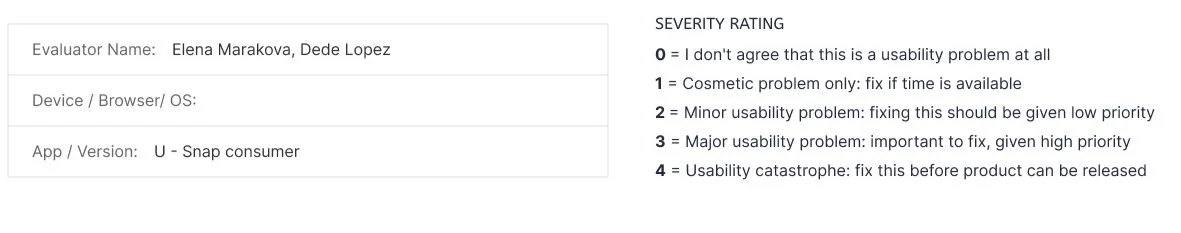
Heuristic Evaluation


Usability Testing
We conducted a Usability test of the current app with 6 individuals to gain insight and obtain an unbiased, accurate, and direct examination of the products user experience. Once we were able to gather feedback, we collaborated on organizing those details into distinct categories.
Affinity Diagramming
In conclusion, we found patterns in inconsistencies throughout the application.


Key Takeaways
We had enough comments to create pinpoints in categories in UX Barriers, Information Architecture, and UI Barriers.
• There was a lack of…
- Clarity of Actions in location of CTA, proposal acceptance, action guides/tooltips, no prompts for action.
- Feedback regarding action confirmations, update notifications and error alerts and preventions.
- Function found in multiple issues in the same request, inability to create request without providers available.
- Visibility of elements. Elements are too small or have confusing meaning, hard to read or no labels.
• A need for a product tour and tool tips.
• The homepage was not user-friendly, and users found themselves spending too much time trying to find a Plumber. Users didn’t understand why recent was at the top of the screen. The categorization were too broad or too specific.
• They also indicated that there seemed to be an endless scroll in the list section.
• There was an unclear representation of icon symbols
Defining our Users


Customer Journey Map
To find areas of opportunities, a customer journey map was created. The persona used for the customer journey mapping was Alma.

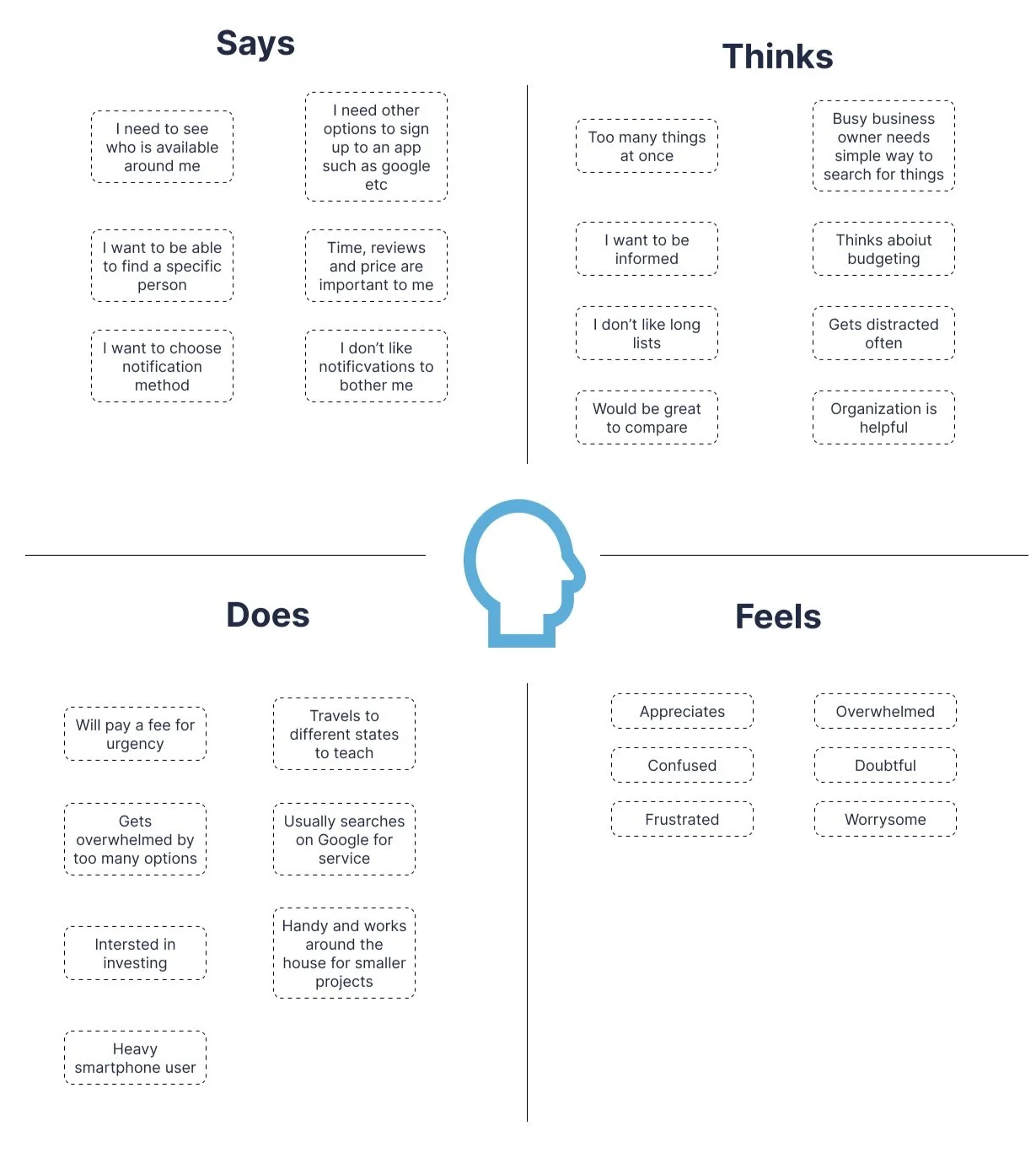
Empathy Map
Next Steps
The next steps is to take the mid-fidelity wireframes to high-fidelity screens.