The Paperless MTA Metrocard

Weekly Product Design
The Challenge
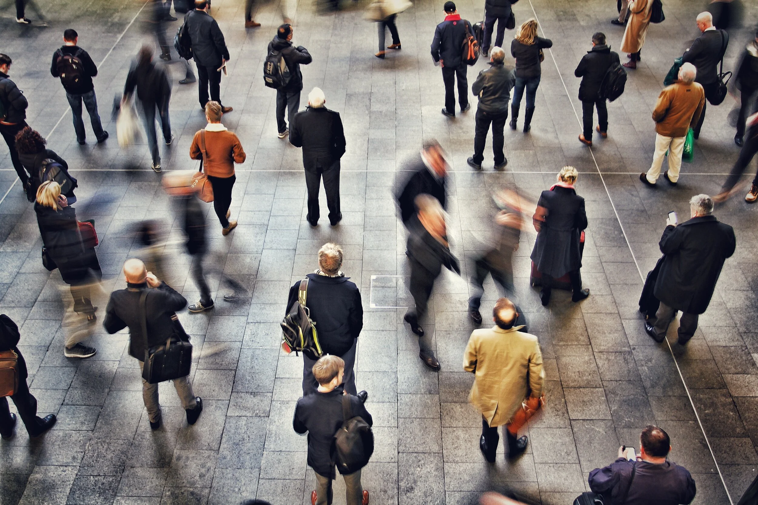
The NYC metrocard system has remained unchanged for decades. The cost of the metrocard machine infrastructure, the lost time of waiting in line to buy a metrocard, touching a dirty machine to do it, the potential of losing the metrocard, and the ease of gaming the system by swiping your card for others has cost the city millions of dollars and leaves much to be desired from the user experience.
Design a new system that allows a daily user who uses the metro everyday or an-out-of-town visitor who will use the metro just once to get access to the metro, on time, without having a physical NYC metrocard on hand.
The Solution
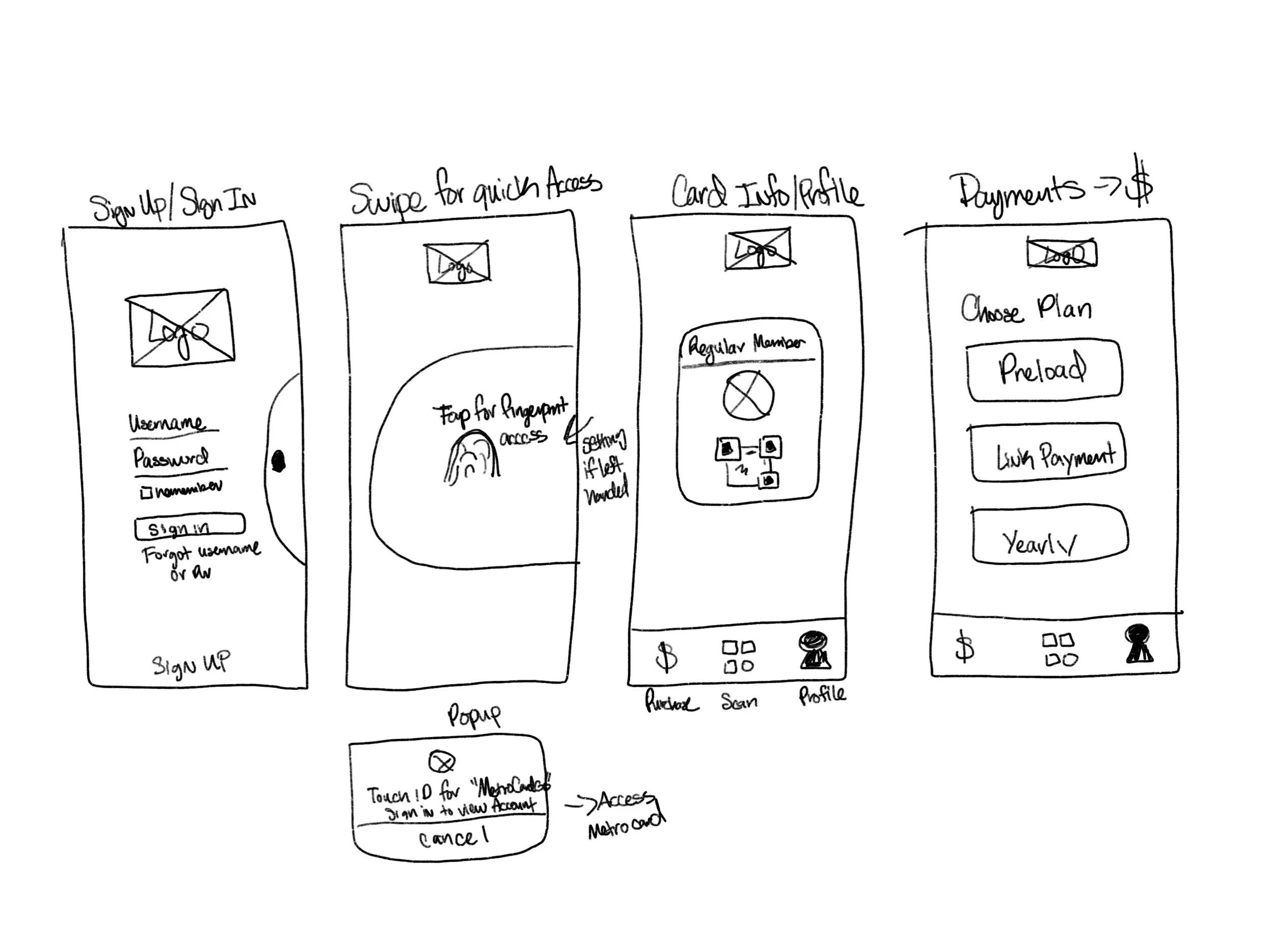
The MTA metro card is 2 step login process. This setup shows a user who has already created an account and is a regular rider. The user can select two options. The user can set up the login to automatically remember when the app is open, or the user can swipe to access the metrocard through a fingertip.
My Thought Process
To begin my process, I began mindmapping, which is a method to organize ideas. It's a scalable way to put images and words together in a more engaging way. This brainstorming method helps during research since it connects one idea to the next, and mind mapping allows me to see the whole picture.
The design challenge gave me an option to either create a solution for an everyday metrocard user or for someone who is just using it once. I decided to move forward with an avid user. During my mindmapping session, I started off with that concept, which you will see below in my chicken scratch. I broke it down into different sections, such as how the technology will be used, how the on-boarding process looks, what it looks like for a new user (exploring that second), and signing up. By creating the map, I was able to see what information I wanted to make and show for my UI Visuals.
Technology
• I landed on iOS/iPhone and App platform
• 2 Steps login process; Sign-in, metrocard visible, maybe flip to other side to scan
On-boarding
• Create account profile
New User (Someone who visits once)
• Email (I decided to not go with that)
Sign Up
• Create metrocard, load metro card with preferred plan, add to wallet.
• User can choose between regular, student, concession or senior

What I landed on
I wanted to explore further on one concept: A user who already has the application and what it would look like accessing the metrocard.
Who is this product made for? Who is the Persona?
With no guided online research, google survey analysis, or user interview feedback. I concluded a persona through my own experience, a family member who travels to work using the metro system. This is what I came up with:
Demographic Profile
Name: John Michael Age: 29 yrs Profession: Electrician Location: Flushing, NY
User Profile and Habits
• Mark lives outside of Manhattan, NY and travels Monday through Friday to get to work.
•He is tech savvy and uses other apps throughout the week such as; Spotify, Apple Wallet, Chase Bank and the Weather App.
• Mark is very familiar with the fast pace lifestyle in New York. He uses several trains to get to work and sometimes has to work in different parts of the city and likes the idea of a yearly plan and paperless metrocard.
• Mark likes to grab coffee every morning at his favorite coffee shop and uses his wallet instead of carrying his cash or card everywhere.
Pain points
Before journey and on journey
• Rushing from one location to the other and relying on paper metrocards
• Running out of money in paper metrocard
• He sometimes loses the metrocard
User goals and needs
• Wants a simple and quick way to pay from one location to the next if needed
• Wants a simple way to show they have paid or have a yearly subscription
• Wants a simple and quick way to access metrocard
Sketching out my idea
During my ideation phase, I focused on the behavior of the persona to create the user flow. Because this user uses several trains to get to work, I focused on how the user behaves while using the product. This user will need something quick and easy to log in.
I sketched out a concept of the user sliding a column to access the fingerprint key. Through this, they will be able to access the metrocard quickly. I visualize the user subconsciously and naturally sliding their finger without looking at the phone while they are rushing.
Narrowing it down to fewer steps


Reiterations
For the third screen, I removed the bottom navigation scan icon to limit the process for the user. I found that the scan icon was unnecessary since the plan is for the app to function as an automatic scan when the user places the phone on the system. When MTA employee checks the rider for their ticket, he/she can scan from the phone.
In addition, I made the scan code bigger and added an ID number.
I updated the bottom navigation by removing the scan iconography because I wanted to simplify the process even more. My idea is to follow the same concept as the iOs wallet.
Design concept
John Michael works in Manhattan as an electrician and travels to different locations to do the job. Sometimes Michael needs to go to 2 different locations in one day. When he is rushing to get through the train entryway, he needs a quick and easy way to access his metrocard. The fingerprint key column allows him to slide an access the second step.

Michael can then tap the fingerprint key to open his metrocard.

Michael uses this metrocard to show the MTA employee who checks if he has purchased a ticket that he is a a regular. He has already paid a yearly plan. He can also use this to access the station entry way.

What can I have done better?
• I would have done user testing using the mid fidelity prototype
• Interviewed more subject matter users who have used such platforms
• Explore the concept of how one time users could use this app
Future recommendations
For the future, with more given time, I would like to explore creating the application for the Apple watch. Through my experience, a lot of my friends and acquaintances have them.
Thank you for taking the time to read my design process on this design challenge. Do share your thoughts!